
Part 1 of a 2-part series on Maps
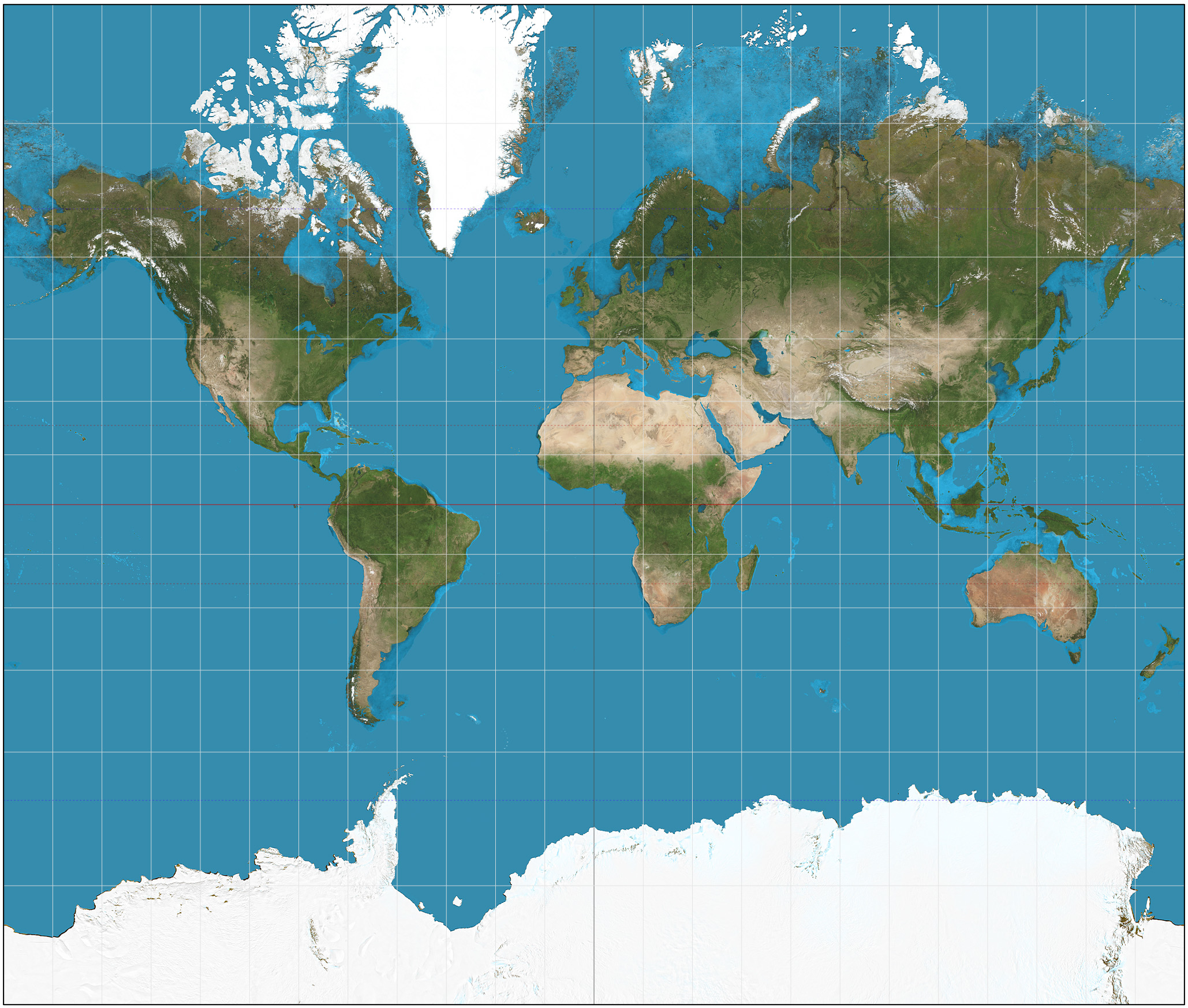
The map of the world.
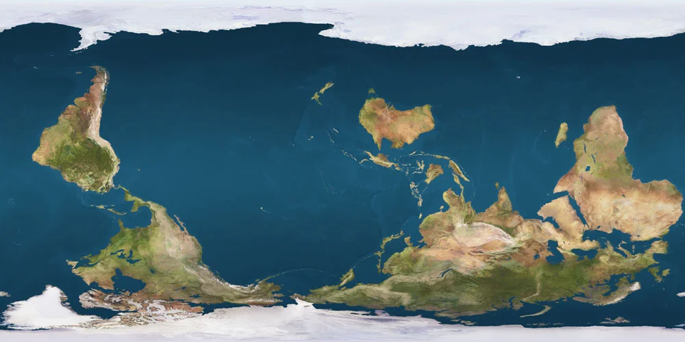
When we look at the most commonly-seen map of the world, we assume that it depicts the earth as it truly is. But this particular projection of the world, like all others in existence, isn’t completely accurate, as it is impossible to avoid distortions when translating three dimensions into two. Known as the Mercator projection, this map was designed for navigation but distorts relative size, artificially enlarging land masses further from the equator. The result is more severe than you might imagine: Africa appears smaller than Greenland, when it is actually fourteen times larger. See this for yourself here.
There are many other, less common projections which you can explore here. Some are equal area projections, such as Gall-Peters, which manage to avoid the relative size distortion of Mercator but are then much less useful for navigation and less accurate with regard to shape. While the Mercator projection has been abandoned by atlases in favor of projections with more balanced distortion profiles, it is still used by popular online navigation tools such as Google Maps given its navigational prowess (unless you happen to be exploring one of the poles, where it is practically useless).
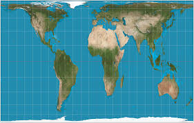
Gall-Peters Projection
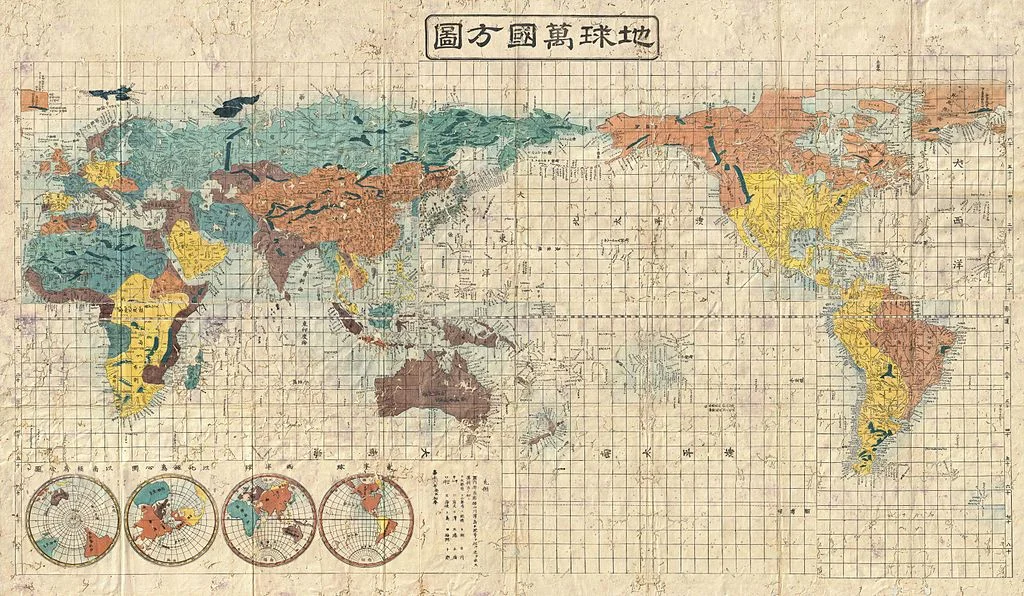
The most commonly-seen map of the world also has a particular orientation and center: north-up and the Atlantic. Yet this framing is neither inevitable nor inherently more correct. Medieval maps were often East-up, Pacific-centered maps pop up in Asia, and a National Geographic feature on the world’s oceans opted to carve up continents instead of bodies of water.
As a result of the complex politics of map-making over time and the inertia of convention, the north-up, Atlantic-centered Mercator projection is the most prevalent, making it not only a navigation tool, but also the image of the world in our mind’s eye. But why does this matter? If all projections are distorted in some way, and orientation, although heavily influenced by historical political jockeying, is ultimately arbitrary, can’t we just continue using it?
There is a big reason why this is not such a great idea: where things are on the map and how big they are in relation to other things affects what we think of them.
Research has shown that we (English-language users) tend to associate up with goodness and down with badness; think about upper and lower class, movement along the socio-economic ladder, “started from the bottom now we’re here”, the assumed location of heaven and hell, and the connotations of uptown and downtown. It has also shown that we tend to associate up with north and down with south (“up north”, “down south”) despite the fact that up/down is an orientation to gravity while cardinal direction is an orientation to the poles. When we are repeatedly exposed to the north-up world map, it reinforces the association of up with north and down with south, and therefore strengthens the association of north with the positive qualities associated with up, and south with the negative qualities associated with down. The popularity of the north-up map makes us more readily associate positive things with northern places.
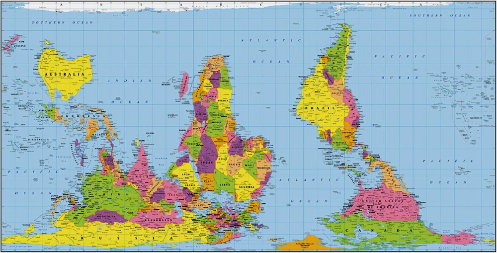
We also tend to associate things in the center of an image with importance, and large objects with importance and strength. Overall, this means that we tend to equate things that occupy large, upper (northern), central places on the map with goodness, importance and strength; and things that occupy smaller, lower (southern) and peripheral places with badness, insignificance and weakness. It is therefore not surprising that some Australians, Asian states, geographers, educators, and even people on The West Wing have pushed for south-up, Pacific-centric and non-Mercator maps.
Now you might be thinking, but I know that those things don’t always match up! Rwanda has a higher percentage of female Members of Parliament than any other country on earth even though it’s in the Global South! China is hugely important in the global economy even though it’s on the periphery of the map! Israel is powerful even though its relatively small size is exaggerated by its proximity to the equator!
But these mental links, also called implicit associations, are mostly unconscious, and they show up in many areas of our lives even when we consciously know and believe that they aren’t correct. In other words, stereotypes and generalizations affect our decisions and behaviors even though we know they aren't always true. This insight comes from implicit association tests, which show that we are quicker and more accurate at sorting things into bins when the bins match up with unconscious associations in our brains, even when we report not having these associations. For example, when sorting words or images that are often perceived as fitting into just one of four categories - fat, skinny, good, bad - we tend to be faster and more accurate when we are putting items that we perceive as fat or bad into one box, and items that we perceive as skinny or good into the other box. We are on average slower and more likely to mess up when we instead have to sort into a box for skinny or bad items, and a box for fat or good items. And this happens even when we report that we don’t believe fatness is inherently associated with badness, or skinniness with goodness. See this for yourself by taking multiple versions of this test.
The most probable explanation for this phenomenon is that it's an evolutionary remnant, which in the earlier days of humanity helped to keep us alive by allowing us to quickly distinguish between safe and unsafe through stereotyping. But the modern-day implication is clear: even if we don't explicitly think that northern, central, or large countries are better, stronger and more important, associations between these categories probably lurk in our psyches. Where things are on the map and how big they are in relation to other things affects what we think of them regardless of whether or not we realize it’s happening. We don’t just shape maps, maps shape us.
These mental links may seem harmless, but researchers have suggested that implicit associations in general contribute to everything from childcare expectations for different genders to police brutality against people of color. They affect decisions like whether or not to cross the street when we see someone walking towards us, where to travel, and which deaths from terrorist attacks to change our profile pictures for.
The particular mental links created and reinforced by this map aren’t harmless either, as they correlate with current and historical global patterns. And when these mental links line up with what’s happening in the world, they perpetuate each other. Although it is sometimes quite handy that associations from our dominant map match reality, it is also limiting, as we tend to see characteristics of certain places as natural and normal, and the resulting global power dynamic as inevitable. For instance, this map and the associations it fortifies make it harder for us to imagine a world where the West (a confusing term generally used to refer to Northwestern Europe, the US and Canada) isn’t the most powerful and important group of countries. When we see things as inevitable and can’t fathom a different reality, we are less likely to intervene to change the course of history. We cannot go somewhere that we have not first traveled in our minds, and with maps reinforcing the status quo instead of igniting our imagination of how the world could be, we are more likely to perpetuate global systems of oppression.
The mental links reinforced by repeated exposure to this map don't just prevent us from taking action, they can also lead us to take part in less-than-ideal action. For example, this particular map reinforces the belief that the West is inherently good and that all countries should strive for our way of life. This belief then informs actions in many sectors, from foreign policy to international development, often resulting in detrimental outcomes for people and planet. Individually, we are encouraged to engage in well-intentioned efforts such as teaching English, which, instead of indisputably beneficial, can be seen as an effort to make “them” more like “us”. Beliefs arising from the associations this particular map reinforces don’t just prevent us from changing things, they support harmful things happening right now.
Instead of being held back by exclusive familiarity with only one of an infinite number of possible projections of earth, we can improve our chances of having a genuinely positive impact by changing our maps. We can continue to use Mercator projections for navigational purposes, but we should switch it up for non-navigational purposes. When hunting down the exact location of a current event you’re reading about, scroll over a pole in Google Earth to flip the world upside down. If you’re buying a world map poster to plan your next trip or track where you’ve been, consider a Gall-Peters projection, south-up or Pacific-centered map; all are relatively easily to find online.
Over time, as you expose yourself to different maps, your mental maps will shift, decreasing the power of certain associations and helping you combat your unconscious internal bias. While daily exposure to our culture and language makes it very hard to de-link up from good, and large and center from important and powerful, changing your maps can delink north from goodness, Africa from weakness, and Small Island States from insignificance (they are, after all, a key climate change frontline). Switching between maps will also remind you that the map is not the territory, and that all maps simultaneously obscure and illuminate. We can also expose ourselves to stories and other media that contradict these associations, a tactic which has been shown to reduce bias when measured with implicit association tests. Purposefully and regularly exposing yourself to other perspectives is also a good life practice, especially for people of privilege, and one of the things travel is perfect for.
SARAH LANG
Instigated by studies in Sustainable Development at the University of Edinburgh, Sarah has spent the majority of her adult life between 20+ countries. She is intrigued by the global infrastructure that produces inequality and many interlocking revolutionary solutions to the ills of the world as we know it. As a purposeful nomad on a journey to eradicate oppression in all its forms, she has worked alongside locals from Sweden to Zimbabwe. She is a lover of compassionate critique, aligning impacts with intentions, and flipping (your view of) the world upside down.